


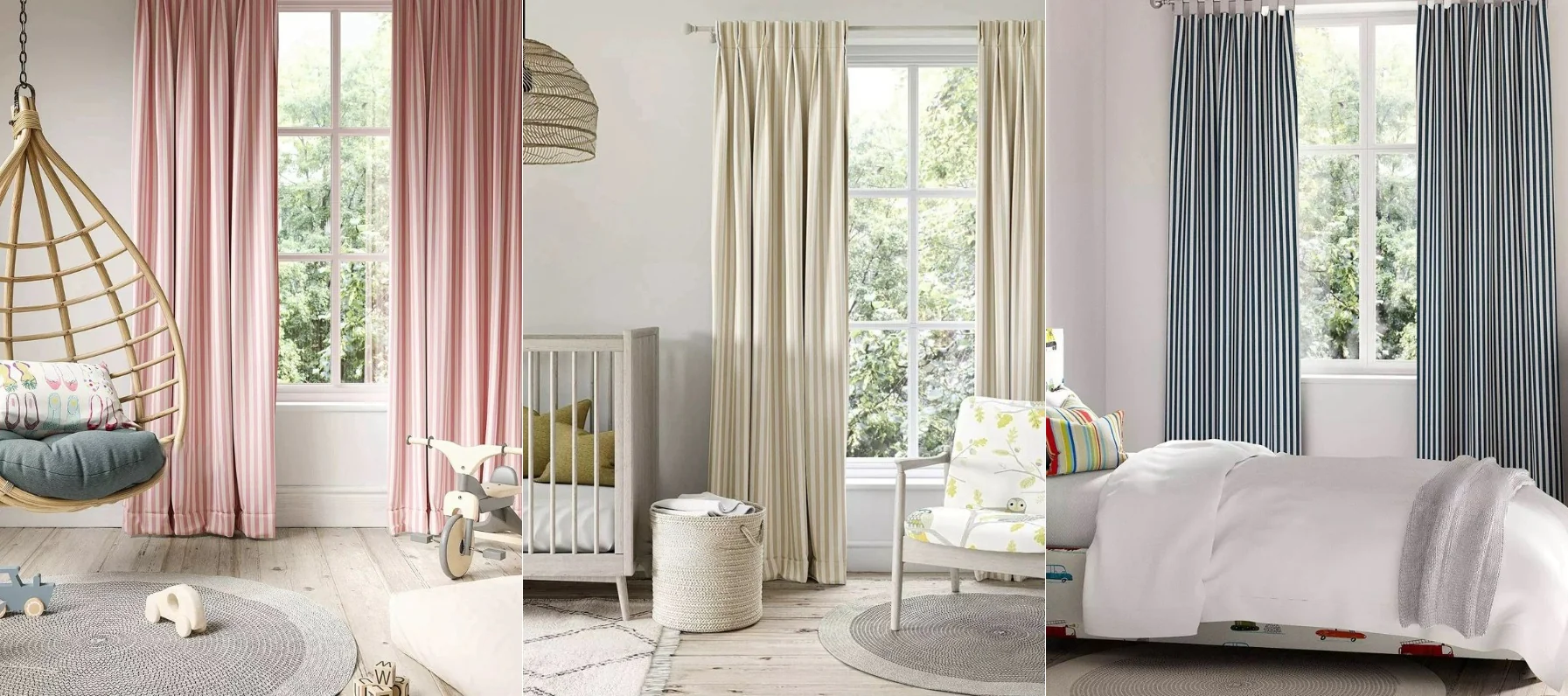
There’s something slightly intimidating about choosing patterned curtains. A patterned pillow feels low risk. Even a patterned rug can be swapped out eventually. But curtains take up vertical space, frame natural light, and sit at eye level every single day. Once they’re installed, they become part of the architecture of the room.
That’s why people hesitate. Pattern feels permanent.
But the truth is, patterned curtains don’t overwhelm a room on their own. What overwhelms a room is imbalance — too many competing elements, poor scale choices, or colors that don’t relate to anything else in the space. When pattern is chosen thoughtfully, it can actually solve problems that solid curtains can’t. It adds depth, softens flat spaces, and brings movement to rooms that feel one-dimensional.
The key is understanding how to integrate pattern rather than simply introducing them.
Start by Evaluating the Visual Weight of the Room
Before selecting fabric, it helps to take inventory of what’s already happening in the space. If your rug is detailed, your sofa has texture, and your artwork is bold, adding large-scale patterned curtains on top of that can feel chaotic. In that case, subtle prints — soft stripes, tonal florals, or muted geometrics — tend to work better because they read almost like texture from a distance.
On the other hand, if your room is built primarily on solids and neutral surfaces, patterned curtains can introduce much-needed dimension. A thoughtfully chosen print can prevent the space from feeling flat or overly minimal. It becomes a focal point that still feels integrated because the rest of the room provides breathing room around it.
Pattern works best when it balances what’s already present rather than competing with it.
Scale Is More Important Than the Pattern Itself
One of the most common mistakes homeowners make is falling in love with a fabric sample without considering how it will look once multiplied across several yards of material. A pattern that feels charming in a small swatch can feel overwhelming when it spans eight or nine feet of fabric.
Large-scale prints can be stunning, especially in rooms with higher ceilings or expansive walls. They feel dramatic and modern. But they need simplicity elsewhere to succeed. Smaller-scale patterns, by contrast, are often easier to live with over time. They create visual interest without dominating the room.
If there’s any uncertainty, it’s usually safer to choose a slightly smaller scale than your initial instinct suggests. Curtains inherently command attention because of their size. They don’t need extra help to stand out.
Consider Architecture Before Adding Drama
Not every window calls for full-length patterned drapery. In kitchens, breakfast areas, or smaller secondary rooms, a lighter approach often feels more appropriate. This is where custom window valances can be especially effective. A tailored valance in a refined pattern introduces personality without consuming the entire wall. Because it occupies less vertical space, it allows you to experiment with pattern in a more controlled way.
In larger living areas or dining rooms, patterned curtains can add elegance when they’re properly proportioned and mounted higher and wider than the window frame. The architecture of the room should guide the level of visual impact you introduce.
Keep Color Relationships Intentional
Pattern becomes overwhelming when it feels disconnected from the rest of the room. Instead of choosing a print in isolation, look for fabrics that echo tones already present in your space. Even subtle repetition — a hint of blue that appears in artwork, or a warm undertone that mirrors wood flooring — creates cohesion.
Patterned curtains feel integrated when they participate in the room’s overall palette. They feel random when they introduce entirely new colors without connection.
It’s less about matching perfectly and more about creating harmony.
Let Light Influence Your Decision
Natural light changes everything. A bold pattern in a dim room can feel heavy. The same pattern in a bright, sun-filled space might feel lively and balanced. Always consider how the fabric looks when backlit. Some prints soften beautifully in daylight, while others become more intense.
If maintaining brightness is important, lighter backgrounds with pattern layered on top tend to feel more breathable than dark, high-contrast designs. Since curtains filter light as well as decorate, their behavior throughout the day matters just as much as their appearance.
Restraint Is What Makes Pattern Sophisticated
Patterned curtains don’t overwhelm a room simply because they’re patterned. They are overwhelmed when everything else tries to compete. Keeping hardware simple, avoiding excessive layering, and allowing negative space in the room to exist all help maintain balance.
When done thoughtfully, patterned curtains can ground a neutral room, add warmth to modern spaces, or introduce softness into structured interiors. They create movement and depth that solid fabrics sometimes lack.
The difference between overwhelming and elevated usually comes down to editing. So, keep a designer’s eye when mixing patterns in your home and avoid bringing too many motifs to the mix that clash with one another.
In Closing
Choosing a pattern for your windows isn’t about being bold for the sake of it. It’s about adding dimension in a way that feels considered. When scale, color, and proportion align with the rest of the space, patterned curtains don’t dominate the room.
They complete it.


